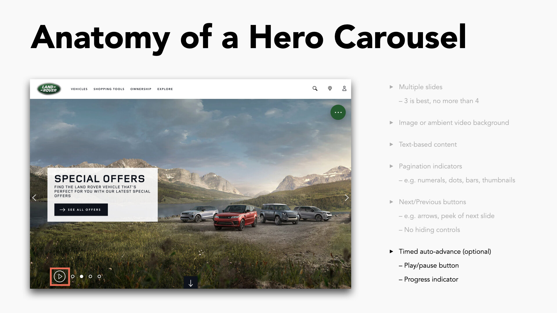
Sleep Number Homepage Hero Carousel
Making a good first impression — in more ways than oneClient
Sleep Number
(In-House)
Timeframe
Summer 2021Roles
UX Research
Wireframing
Visual Design
Motion Design
Prototyping
QA & Accessibility Testing
Project Summary
To elevate first impressions with visitors to the sleepnumber.com homepage and enable simultaneous high priority marketing initiatives at a prime point of real estate, a customized hero carousel was designed and developed to further modernize the Sleep Number online experience. Best practice research, accessibility analysis, visual design and interactive motion all came together to produce an immersive brand presence.
The Challenge
Business stakeholders from the ecommerce team expressed their desire for a new format to present material on the Sleep Number home page. They needed a way to promote multiple campaign initiatives that could take advantage of user segmentation for targeted display, and they wanted a modern approach that pushed the envelope in escalating brand presence at this primary entry point. The site already had multiple executions of content carousels but this solution needed a strong and lightweight method to maximize engagement without distracting from the immersive material.
The Solution
Research suggested that the average site visitor shies away from carousels with rapid panel transitions and poor indication of the content living on other slides. A proper harmony needed to be struck between stakeholder needs and common user expectations. A deep dive into industry trends for immersive homepage carousels revealed a number of interesting stylistic insights, yet many of the more striking examples seemed to directly contradict my research in the arena of accessibility compliance. With the homepage being a critical first impression for most visitors, there was a strong tension between the desire for an arresting first glimpse at Sleep Number’s brand presence and the need to not alienate visitors with additional considerations beyond the baseline experience.
Considerations were taken to evaluate the pros and cons around full-width, full-height panels and what methods were needed to keep visitors from feeling trapped into a non-scrolling experience. Through multiple visual explorations the team opted for the fully immersive treatment with inclusion of a scroll indicator to encourage vertical exploration.
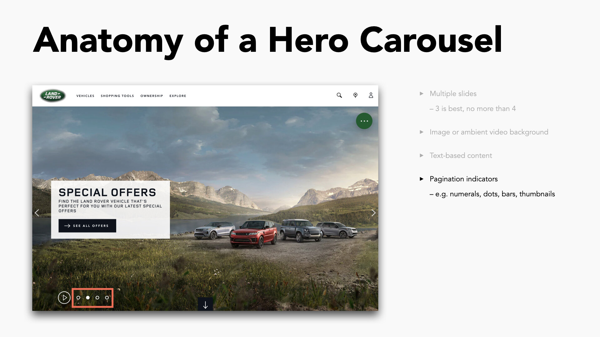
In regard to pagination styles, my broad survey of techniques revealed roughly four common indicator types that could be mapped along a spectrum of engagement. Research suggested that the simpler the indicator was, the less likely a user was to engage or even notice its presence. Furthermore, it revealed that the most effective indicators included either a contextual label or graphic representation of what could be expected after interacting with that thumbnail (or a combination of the two). Understandably, the drawback of a maximal pattern like this is the potential to steal attention away from primary content, so the UI needed further consideration to let the active panel shine on its own with a graceful solution.
Desktop WireframeMobile WireframeUltimately we landed on a minimal bar solution that stayed out of the way from users unlikely to engage with carousel content, but planted strong contextual hints for those showing intent to engage. The bars doubled as slide indicators and progress markers for when autoplay is enabled. Labels for each bar show clear context to what the indicator represents, and hover states were implemented to display an animated thumbnail peeking up with the content to be expected on inactive slides — further enticing users toward taking action.
Accessibility was considered on several fronts. The inclusion of a play/pause button functioned to stop all panel movement, whether it be slide-to-slide transitions of ambient video backgrounds for slide content. Keyboard tab index ensured the first option on the panel to come in focus was to pause button to control motion. Contrast between the UI controls and the imagery beneath it were fine tuned with just the right calibration of darkened scrim, properly vetted to abide by AA compliance with WCAG 2.1 standards, regardless of the background asset chosen by business users.
Visual Comps and Animated TransitionsUp Next
BowFlex: Next Gen Strength Machine
PRODUCT DESIGN & UX RESEARCH

